
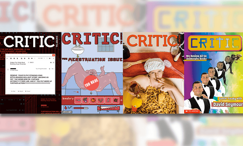


Otago University’s student magazine Critic Te Arohi has had a stellar couple of years, producing bold, disruptive journalism that delights in poking authority with a large stick. Respective editors have taken the same approach to their covers, producing a number of anarchic images designed to provoke and titillate (with great success).
As anyone in magazine publishing can tell you, covers have their own stories to tell, so The Spinoff asked some of Critic Te Arohi’s best and brightest to tell us the tales behind their favourite covers.
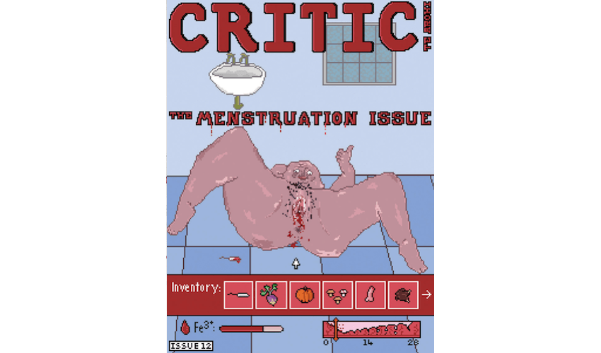
The Menstruation Issue
Possibly the greatest student media cover of all time was in 2013 by the University of Sydney student newspaper Honi Soit, which featured closeup photos of 18 vulvas. It pushed the boundaries so far that the newspaper was banned and the editors were told they could be in breach of the Crimes Act.
Student media can – and in my opinion, must – push boundaries and do things no other media does; challenge sensibilities and start conversations. Ever since I started at Critic, that Honi Soit cover was something I aspired to create.
The idea for the Menstruation Issue came from the Womens+ Club, which some of our writers were involved in. They wanted to get in people’s faces and create conversations about a topic that was normally taboo.
From a cover design perspective, we didn’t want to beat around the proverbial bush; no weird blue liquids or cutesy hints. There was only one option: a bleeding vagina.
Saskia Rushton-Green is an artist with this incredible grotesque but fascinating style. If we wanted an image that would make people uncomfortable, she was the one to do it.
Weird fact about that cover: Saskia didn’t have access to any design program at the time, so the entire thing was generated using the paint tool on Microsoft Powerpoint.
The video game-inspired pixel art was entirely her idea. I wasn’t too sure about it at first because the pixelation meant the image was a little less graphic than it could have been otherwise. She drew an alternative which had the genital area in more focus, but we ended up sticking with her original design.
I’d be lying if I said I didn’t hope we would get complaints. There’s a slogan within Critic that goes ‘Piss off old people, don’t piss off woke people’.
But while we expected complaints, we didn’t expect all-out censorship. A day after it went out, about half the issues mysteriously disappeared from campus, destroyed (we later discovered, after a hectic week of investigation) by Campus Watch. Read more about that here.
– Joel MacManus, Critic editor 2018
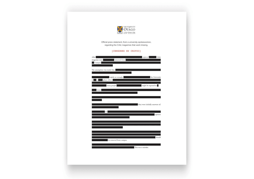
The Censored Issue
I think most of the best stuff Critic does is a result of extreme over-tiredness or our tendency to spend most of the ‘Kitchen Tea/Coffee’ budget line on whiskey.
The week the Menstruation Issue went missing was a hectic mess of media interviews, meetings, and people randomly showing up in our office to try and organise protests. On top of that, we still had to put out a magazine.
I stupidly agreed to get up for a radio interview at 6:30am on Thursday, which is the day before we go to print. We didn’t send the final copy to the printers until 5:30 am on Friday.
After the Menstruation Issue, we knew it kind of didn’t matter what we put on the cover the next week. All 5,000 copies were going to be picked up in a flash.
Some ideas we tossed around included:
- A reprint of the same menstruation cover.
- A bleeding penis, drawn in the same style.
- A blank white page.
- A middle finger.
- The words ‘Try steal this one, fuckers.’
- A big red ‘Censored’ stamp across the cover.
Whatever we went with, I felt it had to have some pushback against the university itself, but I wanted to avoid targeting Campus Watch.
While the media narrative pitted Critic against Proctor (who heads Campus Watch), I knew he was just taking the fall for one of his staffers.
It was the official response from the university itself that pissed me off more.
In the timeline of events, the magazines disappeared on Monday evening. I spent Tuesday talking to the University and Campus Watch trying to get CCTV footage which could help work out who it was.
We only found out that the University was responsible at 6 pm Tuesday evening when the university sent out a media release in response to questions put to them by Stuff. They never came to us directly.
That statement included the line: “The University has no official view on the content of this week’s magazine. However, the University is aware that University staff members, and members of the public, have expressed an opinion that the cover of this issue was degrading to women.”
It was a weird, petty, and backhanded insult that was trying to condone what they did while simultaneously absolving themselves of responsibility.
A later OIA would reveal that the University had in fact not received any complaints from anyone prior to the magazines being destroyed except the very Campus Watch staff who decided to remove and destroy the copies.
The fact that the first release didn’t include an apology just made the backlash even worse and the University kept having to slightly change their official line over the course of the week
The cover is actually not one but all three of the series of backtracking media statements they put out.
There was an OUSA student general meeting on that week, one of those very important but very boring things that Critic has to cover. I ended up paying absolutely no attention and spent the whole time messing around with a printout of the statement, trying to get it to somehow make sense.
It didn’t end up perfect, (the ‘no opinion should be removed from campus’ ended up getting repurposed by an alt-right guy who was upset other students were tearing down his racist posters), but it was a functional sentence that made some sense.
– Joel MacManus, Critic editor 2018
The Fish and Chips Cover
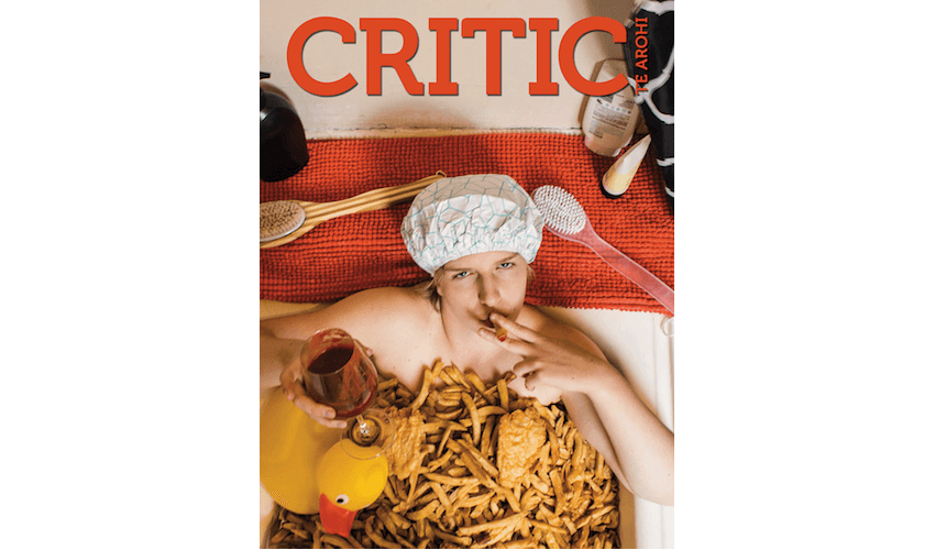
The idea for the cover of our annual Fish and Chips review came from art director Jack Adank, who had a vision of replicating an image of Tupac in a bathtub covered in bling.
That was partially shot down by Erin, who pointed out that two of the last four covers had also featured naked men lying down – one sensually on a bed for the Sex Issue, and one being vomited on for a piece about initiations. So we decided to get a woman.
Critic has since learned that you could just put a call out on Facebook for a girl willing to take a bath in some fish and chips and get like 30 or 40 responses (see: Charlie’s entry on the 2019 sex issue), but that didn’t occur to me at the time.
After failing to convince any of our female staff or volunteers to put themselves forward, I managed to guilt my very amazing and beautiful girlfriend Kate into doing it. I promised her she could have all the chips she wanted but by the time we set everything up they were all soggy and gross.
That photo is 50 scoops of chips, two fish, and a hotdog from Mei Wah takeaways, who we awarded first place as thanks for the thousands of hangovers they save the students of North Dunedin from every year.
In my mind that was going to be enough to fill the bath. It wasn’t even close, 90% of the chips we had are in that photo. Most of the bath is the inner fluff from two pillows, then the wrapping paper, then the chips. We tried our best to maintain the illusion, but you can see some paper at the bottom sides.
– Joel MacManus, Critic editor 2018
ODT Watch Cover

Critic and the Otago Daily Times have an awkward relationship. The ODT loves to shake its old man fist at students for stepping on its lawn, and Critic loves to rip them out for their weird and inane content. I wrote a kinda self-indulgent history of the last twenty years of Critic/ODT relations, and while researching I found a 2003 cover that parodied the front page of the ODT. Figuring that stealing from ourself wasn’t real theft, we copied the concept.
This cover is one of my favourites because of the amount of tiny details we put into it. Unlike the 2003 cover, every bit of ours mirrors the ODT’s actual front page, from the 4.20 price (69c delivered.RD fees may apply) to the North Dunedin weather report. Also, the ad for the second-hand car in the bottom left corner was a real ad our designer put in to try to sell his car (he didn’t get any offers).
We looked into going all out and actually printing tabloid size on newsprint, but it turns out that the only place in Dunedin that could do that was the ODT itself, and we thought they might have a few things to say once they saw the design file.
– Charlie O’Mannin, 2018 news editor, 2019 editor
Sex Issue Cover
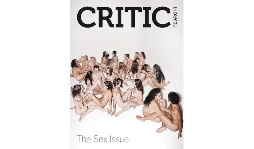
The sheer admin of getting 24 naked people into a room, checking IDs, getting people to sign consent forms, letting people know exactly what was cool and what wasn’t, making sure no one was feeling uncomfortable, randomly assigning people partners, accounting for people who didn’t want their faces shown, and then also setting up the shot in such a way as to not explicitly show anyone’s genitals, was a feat.
But despite the stress, the photoshoot was the best I’ve ever been a part of. Everyone was comfortable and excited about getting naked with complete strangers. Almost all of them came up to me afterwards and thanked me for the experience, talking about how freeing it had felt.
The models had such a good time that they hijacked the Facebook group chat I’d been using to coordinate them and tried to start a nudist club. They had a (clothed) BYO the following week, which was followed by a (naked) flat party, which definitely did not become an orgy.
– Charlie O’Mannin, 2018 news editor, 2019 editor
Email Cover
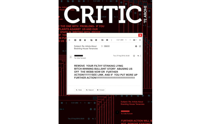
Recently we wrote a story about the ways in which landlords can fuck over their tenants by making them sign illegal fixed-term contracts. We’ve covered a lot of landlord stories over the past few years, and they’re always the ones with the most drama. The reporter who was on this tenancy story got an email at 3.01 am from the landlord involved. She’d obviously taken offence, and threatened us with “FURTHER ACTION!!!!!!!!!!!!” unless we took it down.
As soon as I saw the email, I wanted to put it on the cover.
In a single email, she showed just how abusive landlords can be and how they can use the power imbalance to fuck with their tenants. Also, of course, I wanted to show that we stood by our story, and wouldn’t be swayed by threats. But most of all, it was just a quintessentially Critic way to respond. Critic’s whole thing is that we aren’t traditional media and we don’t have to fit traditional rules. You can’t shut us down in the same way.
– Charlie O’Mannin, 2018 news editor, 2019 editor
Animorphs Cover
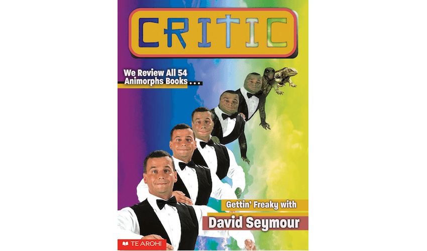
When I think of this cover, I always think of Rosemary’s Baby, Roman Polanski’s 1968 American psychological supernatural horror. It’s about a woman who is just trying to have a jolly old time but ends up giving birth to the literal devil because everyone around her is in a weird cult, which is pretty much exactly how this David Seymour/Animorphs mash-up came about.
The three main features for the issue were a piece on Animorphs, an interview with David Seymour, and an investigation into a shape-shifting lizard conspiracy theory website. The idea was to merge them all together.
I definitely thought that it would not get printed. But Joel [MacManus] used to do this thing where you would show him something and be like “haha I’m ruining our magazine,” and he would lean back in his chair, take a sip of whisky, puff on a cigar, and say “send it straight to the printers, toots”. Which is how we ended up with perhaps the worst piece of design ever made, and a deeply troubled reptile who has to live with their face been warped horrifically into David Seymour’s.
I’ve never read an Animorphs book, but I spent a lot of time looking at the covers as a child. Apparently David Mattingly, the illustrator of almost all of the Animorphs books, would do photo shoots with the kids and sometimes their morphing animal too. Obviously we didn’t have the time, budget or consent to set up David and a lizard for a photoshoot, but if he pays for a reshoot I promise to do better.
– Erin Broughton, 2018 part-time designer