


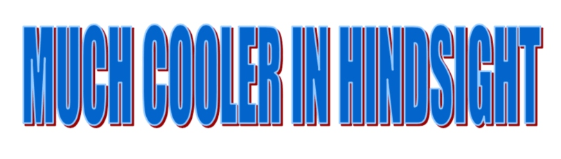
School projects weren’t complete without a meticulously selected WordArt title. Madeleine Chapman looks back at the fonts that shaped many children’s lives.
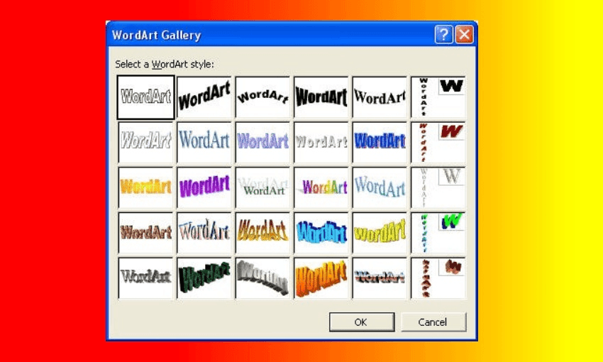
Once upon a time the most important decision in life was choosing a font. Every school project needed the perfect font. Not for the body of text; Arial shmarial, who cares. No, every school project needed something more. Something unique, or as unique as you could get within the constraints of exactly 30 options.
Every school project needed WordArt.
If the teacher assigned one hour for a project, 45 minutes of it would be dedicated to choosing a title and subsequently a WordArt font. An incredible time investment considering, once again, there were exactly 30 options to choose from.
But not only were there finite options, there was – in hindsight – decidedly finite range. Oh how we marvelled at the diversity anyway. This one is yellow and squiggly and this one is yellow and pointy! And this one is just normal text that’s been sat on!
It was cool in 1997 and managed to stay cool until at least 2005. Thanks to the current climate of irony to a fault, it’s cool again in 2019. Nothing is original and nobody cares.
But enough about life, WordArt was invented to celebrate colour and style. And your choice of WordArt font says more about you than any personality test ever could. So what better place to start than the fonts without colour or style.
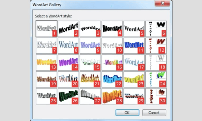
Note: I asked every current MP under the age of “old” for their WordArt preferences. Shockingly few got back to me but those that did are featured below.
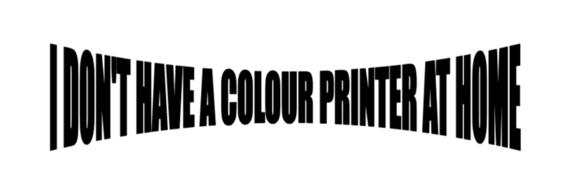
I utilised the top row of WordArt a lot because we didn’t have a colour printer at home and even when we eventually did, I was very far down the list of “people allowed to print in colour”. It’s amazing how much time you can spend perfecting the intensity of a curve when you haven’t got bright colours doing all the heavy lifting.
These boring options also acted as a solid foundation if you were planning to go multi-layered and colour in on top of your printed work. A bit of versatility never hurt anyone. National MP Sarah Dowie has admitted to using number four the most which is admittedly a little terrifying. What’s more terrifying is that she followed up with “and sometimes 15”. That’s the weirdly formal font. Nobody used that one.
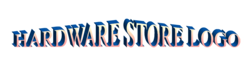
Meanwhile, fellow National MP Simeon Brown’s favourite was number three because “it was a great header when I was creating a document. It draws attention to the topic but also fits well as a page header.” Breaking news: Simeon Brown is in fact 95 years old.
I don’t even recognise this font. Which means that even as a desperate ten year old procrastinator, I never stooped so low as to test out this option. It looks weak as a thumbnail and even weaker full sized. Why? Because everyone knows you can get that effect and more by writing with a highlighter then tracing around it with a bic pen.
I didn’t see this one used a whole lot growing up but looking at it now, it was before its time. Crisp, with just a little bit of flare. It doesn’t go too well with black text which perhaps explains its lack of utility for bad school projects.
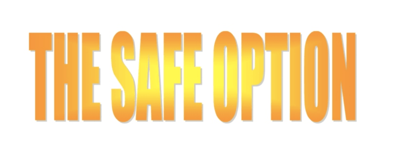
For those who wanted colour but couldn’t handle shadows and weird angles. It was a very safe option but so often the yellow in the printer would be low and that middle bit would just be white which ruined the effect.
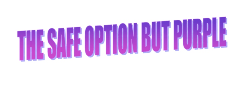
Can’t ruin the yellow fade if there’s no yellow in your printing. Still the same safe font but pushing the boat out with a little shadow. It’s for when you wanted to say “I keep it simple, but I’m flexible”.

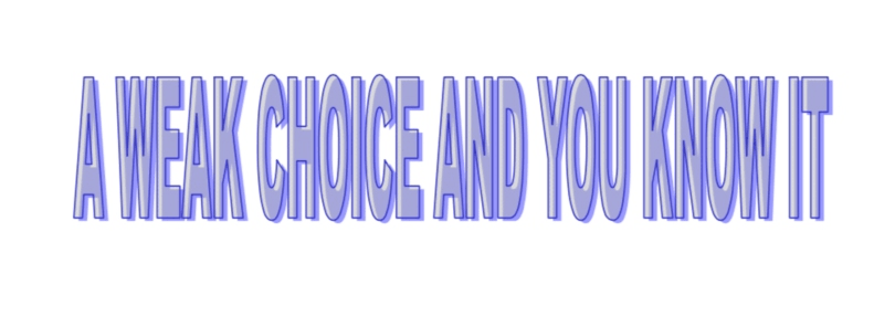
Sarah Dowie was 22 when WordArt came out so her admitting to “sometimes” using 15 (this font) is almost certainly in reference to her CV. Look, it does the trick. But still… using this WordArt font is like using a diamond to hammer in a nail. It technically works but no one should ever do it.
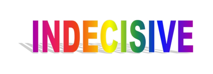
Want to use a bit of colour to distract from your under-researched and poorly written profile on Gandhi? Make up for a complete lack of a bibliography and put every colour in!
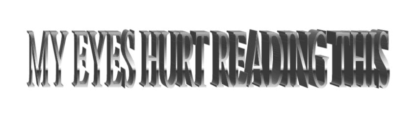
The words are so…thin. I don’t trust anything I can’t see.
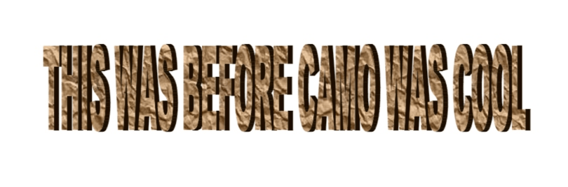
A lot of boys in my class used to choose this font because it seemed the most “manly”. If by “manly” they meant “supremely ugly” then yes.
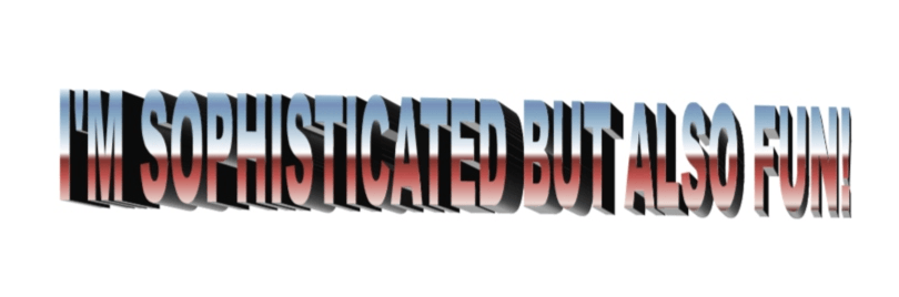
This one was surprisingly popular because the fading on the lettering is actually quite cool. And who doesn’t love a mix of hot and cold colouring. But that barn roof tilt…sell me an $8 set of paint rollers or get out of my sight.
Self-explanatory. Green MP Golriz Ghahraman had some harsh words for this font: “The ones with shadows are creepy and lack integrity because how would a letter stand up to make shadow if its not 3D?!? Chunky letters, straight or diagonal, got me every time. Thanks for asking.” You’re welcome, Golriz.
Noted person-who-knows-about-colours-and-shapes, Toby Morris, was fond of this one. So I guess it’s good. One time a boy in my class made the body of his project this font. It was impossible to read and, judging by the size of those letters, probably about 45 words in total. Gandhi’s life told in 45 angled block words is good content.
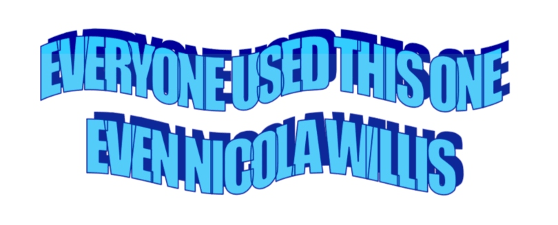
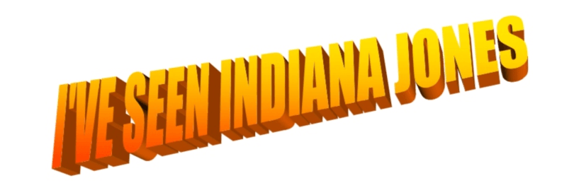
And education minister Chris Hipkins (“Minister Hipkins has always preferred things that are three dimensional! ;)”) Pretty sure those are 2D letters making a shadow that Ghahraman hates but let’s not get into it. Labour MP Kieran McAnulty once used this font for a geography project “because it resembled hills.” Again, let’s not get into it.
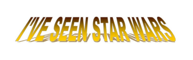
But the biggest fan of this font is in fact National MP Nicola Willis. “Number 22 had it all. Sensual curves, alluring shadows. It stood out. It was creative. It was art. Word art.” Horny descriptors aside, is Nicola Willis…funny?
In the world’s least surprising reveal, David Seymour, leader of the (yellow) ACT Party, said this font was his favourite. At least that’s what I assume he meant when he completely ignored the numbered chart and responded with “I would have used yellow, upward expanding font.”
Who is this font for? Not me, and not anyone with eyes.
What even is this and who even are you if you ever used this.
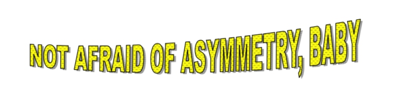
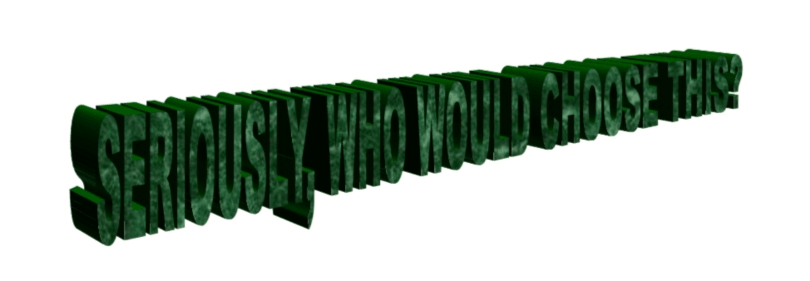
I hate this so much. Any title longer than two words and you’re taking up half your front page with it. Look at that weird upwards angle too. An affront to style, an affront to decency, an affront to all words and all art.
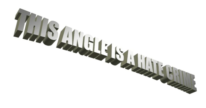
The colours here don’t really make sense. What is that supposed to be? Am I missing something? It looks like the lettering on a mid ’00s sedan as it’s driving past The Warehouse on a clear day but something tells me that’s not what the designers were going for. Anyway, it’s a bit much.
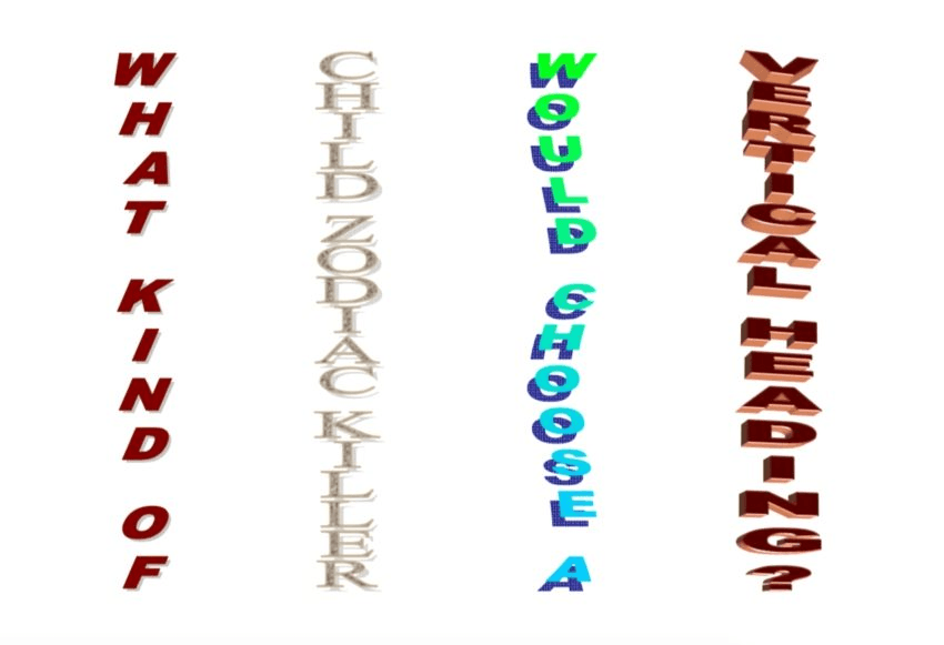
If you’ve ever used a vertical heading in a Microsoft document I have two questions for you.
- How dare you?
- How did you get it so that the rest of your text didn’t freak out and move all over the place and sometimes disappear completely?
Long live WordArt and long live the only decision that mattered.