


Here’s The Spinoff’s weekly round-up of data tracking the effects and response of Covid-19 around the world – and how New Zealand stacks up.
Last week we began a weekly summary of data and visualisations drawn from Our World in Data’s work on the Covid-19 pandemic, which is freely available for re-use. Not all data is complete: measurement techniques vary between countries and sometimes within them. Details for each country can be found here.
The countries we’ve chosen to compare are New Zealand, Australia, the US, the UK, South Korea, Sweden, and Singapore. Where possible, we’ve included China and Taiwan; there is less data available from these countries so it can’t always be included.
Deaths per million
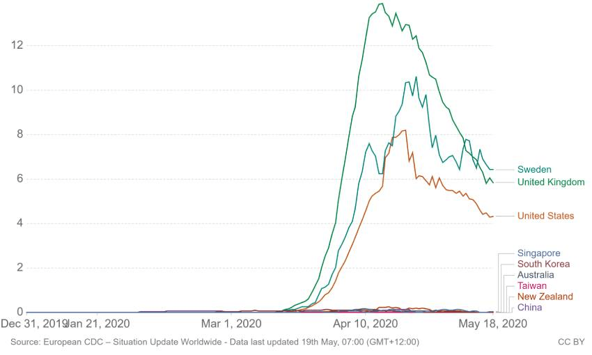
Shown is the rolling seven-day average. Limited testing and challenges in the attribution of the cause of death means that the number of confirmed deaths may not be an accurate count of the true number of deaths from Covid-19.
Our top four remain the same from last week, but the others have shuffled around. While Singapore’s rate has remained the same – 0.05 daily deaths per million – all other countries measured have decreased since last week’s seven-day rolling average. Last week, both Sweden and the UK were looking at an average of more than seven deaths per million people each day. Now, Sweden’s sitting at 6.42 and the UK has made a tremendous leap down to 5.85.
New Zealand is a stand out this week for having a seven-day rolling average of zero deaths per million per day. Taiwan, Australia, and China all reported fewer than 0.01.
Daily confirmed Covid-19 tests per 1,000
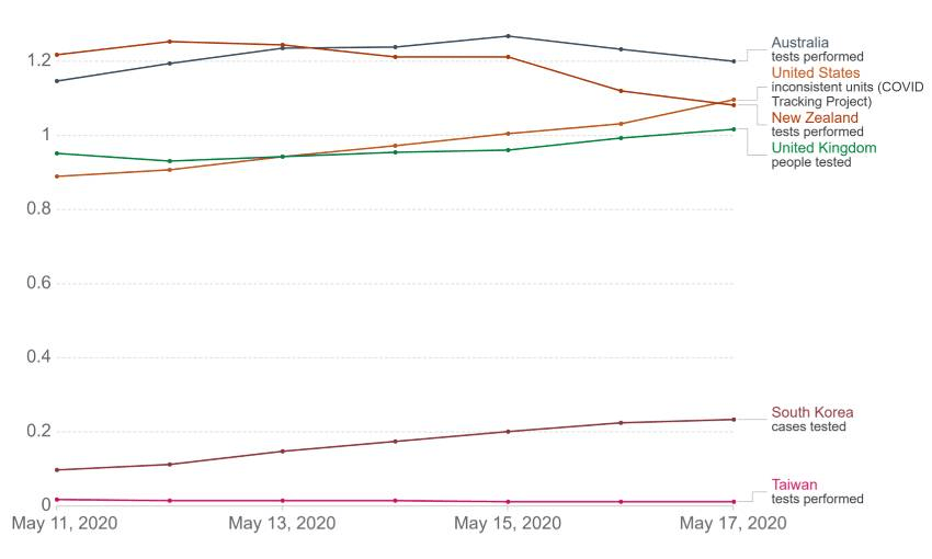
This is also a seven-day rolling average. For testing figures, there are differences across countries in terms of the units, whether or not all labs are included, the extent to which negative and pending tests are included, and so on. It’s not a perfect measurement. Once again, it’s important to note that US numbers are slightly inconsistent here because they’re taken from the Covid Tracking Project, not the CDC.
We can see daily testing is still increasing across the board, even as cases decline in some countries; for those with an elimination strategy, catching even mild cases is important.
This graph measures a seven-day rolling average of people tested for Covid-19 per 1,000 each day. For example, over the past week New Zealand’s rolling average was 1.08 people per 1,000 each day. New Zealand’s population has just hit five million, so this statistic would amount to 5,402 tests per day.
According to the daily press briefing, on Monday 3,125 tests were processed across the country. We had a weekly high on May 13 with 7,150 tests carried out.
We’re neck-and-neck with the US, who are testing 1.10 people per 1,000 each day, which for them amounts to 361,020 people.
Taiwan is staying relatively steady at 0.01 people tested per 1,000.
Case fatality rate
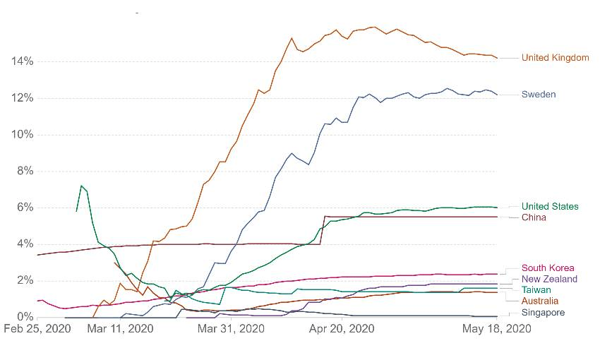
The case fatality rate (CFR) is the ratio between confirmed deaths and confirmed cases. Bear in mind that CFRs aren’t always the best measure of a disease’s risk. This is because it measures confirmed cases and confirmed deaths. In some instances, deaths that could be a result of Covid-19 infection aren’t necessarily logged that way. In others, plenty of cases aren’t confirmed or even tested; the UK, for example, only recently expanded its testing criteria to include those with milder symptoms.
The CFRs remain basically the same compared to last week, but Taiwan and Australia have swapped positions; New Zealand, Taiwan, Australia and Singapore all remain below 2%. The UK and Sweden have both experienced very slight decreases in CFR, from 14.53% and 12.25% to 14.21% and 12.21% respectively.
If you’re interested, EuroMOMO has been recording excess deaths in Europe, which paints a broader picture of Covid-19’s death rate.
Deaths per million vs GDP
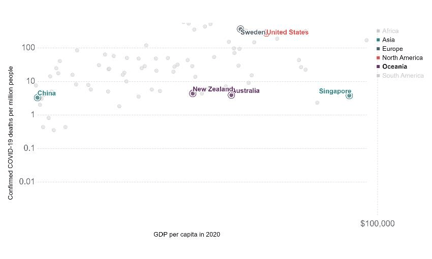
Just out of interest, you can plot a country’s GDP per capita alongside its deaths per million. This could be interpreted in a few ways, so we’ll stick with what we know: Sweden and Australia have very similar GDP per capita; $90,220 and $94,788 respectively (both in NZ dollars). However, their deaths per million are vastly different. Of course, Sweden and Australia have totally different GDPs when not balanced by population.
What we can see here is that a country’s economic wellbeing doesn’t necessarily set it up for a pandemic. New Zealand, Singapore, Australia and China are all on a pretty even keel when it comes to Covid-19 deaths per million, but when it comes to GDP per capita they’re on different boats.
Contact Tracing
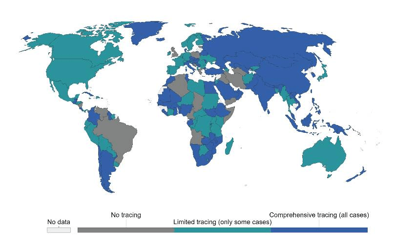
The app NZ Covid Tracer was released last night, but even before that we were in the “comprehensive tracing” category. It’s interesting to see Australia is grouped in “limited tracing”; it already had an app. There have been doubts about using cellphones for contact tracing, as such a system wouldn’t be able to capture those who don’t own them, including people who can’t afford them, children, and some elderly.
Despite any ethical qualms, it looks like technology has a vital role to play in the fight against Covid-19. Hong Kong, Taiwan, and South Korea have all made good use of technology for contact tracing, and their efforts are clear in their low case rates (obviously there are more factors at play than just technology, but it helps). Hong Kong instituted a mandatory 14-day quarantine for all new arrivals to the country, just like we did; except their new arrivals downloaded the StayAtHome app and were given wristbands that geofenced them to their quarters. Among a population of nearly 7.5 million, they’ve had four deaths from Covid-19.