


Here’s The Spinoff’s weekly round-up of data tracking the effects and response of Covid-19 around the world – and how New Zealand stacks up.
Our weekly summaries of data and visualisations use Our World in Data’s work on the Covid-19 pandemic, which is freely available for re-use. Not all data is complete: measurement techniques vary between countries and sometimes within them. Details for each country can be found here.
The countries we’ve chosen to compare are New Zealand, Australia, the US, the UK, South Korea, Sweden and Singapore. Where possible, we’ve included China and Taiwan; there is less data available from these countries so it can’t always be included.
Deaths per million
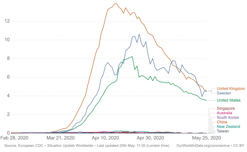
Shown is the rolling seven-day average of daily deaths per million people. Limited testing and challenges in attributing the cause of death to Covid-19 mean that the number of confirmed deaths may not be an accurate count of the true number of deaths from Covid-19.
This week, China and Taiwan join New Zealand in the zero group. Australia’s had a very small bump up from fewer than 0.01 daily deaths per million per day to 0.02.
The UK and Sweden have swapped places, with the UK now registering the most deaths per million per day at 4.54 and 4.51 respectively. For Sweden, this is a significant decrease from 6.42.
The US, Singapore, and South Korea have all had slight decreases.
Daily Covid-19 tests per 1,000
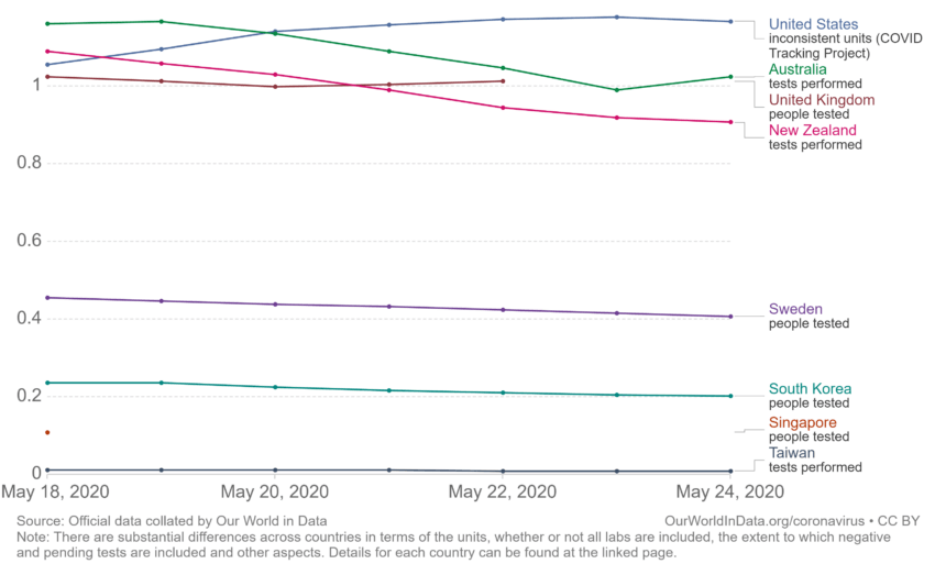
This is also a seven-day rolling average. Testing is measured differently between countries, so this isn’t a perfect comparison. The US numbers are taken from the Covid Tracking Project, not the CDC.
The most recent data is from May 24. It looks like our top two have swapped places; the US is now in the lead with 1.17 tests per 1,000 people per day, with Australia close behind at 1.02.
While the US has increased its testing, over the past week New Zealand’s average has gone down from 1.08 to 0.91. This will reflects our decreases in cases and alert levels; we currently have 22 active cases, a decrease of five since Monday.
This is the first week Sweden’s had data available for daily tests per 1,000. It’s middling on our chart, but on Statista’s Nordic comparison chart it’s down the bottom; it’s also got the highest number of confirmed cases of all Nordic countries. This is impressive when you consider they’re probably missing a few due to a lower testing rate.
Case fatality rate
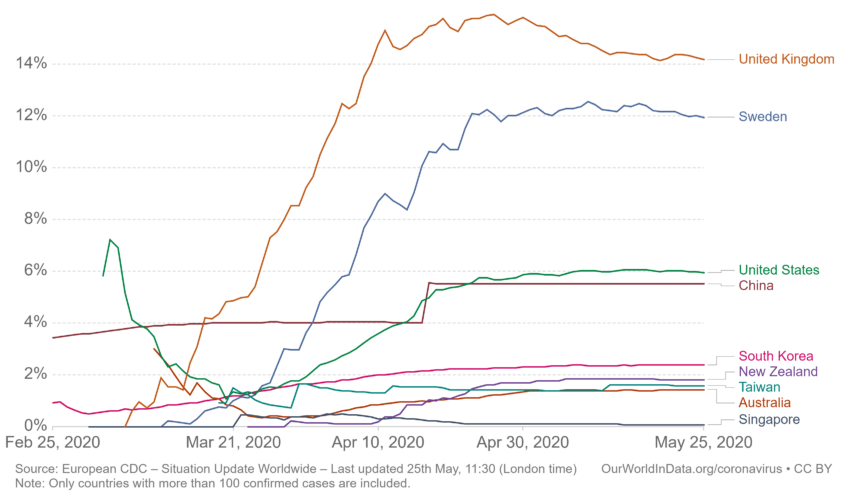
The case fatality rate (CFR) is the ratio between confirmed deaths and confirmed cases. CFR isn’t always the best measure of a disease’s risk, because it measures confirmed cases and confirmed deaths. In some instances, cases are missed due to low testing rates; in others, deaths attributable to Covid-19 aren’t recorded as such.
The UK still has the highest CFR, but has once again seen a small decrease from 14.53% to 14.18%.
Sweden’s had a decrease from 12.25% to 11.95%.
South Korea has a CFR wobbling just above New Zealand’s. Earlier in the month, it saw a surge in cases after loosening restrictions around gathering in bars. Surges create more pressure on a healthcare system than lower, more predictable numbers of patients.
Government stringency index
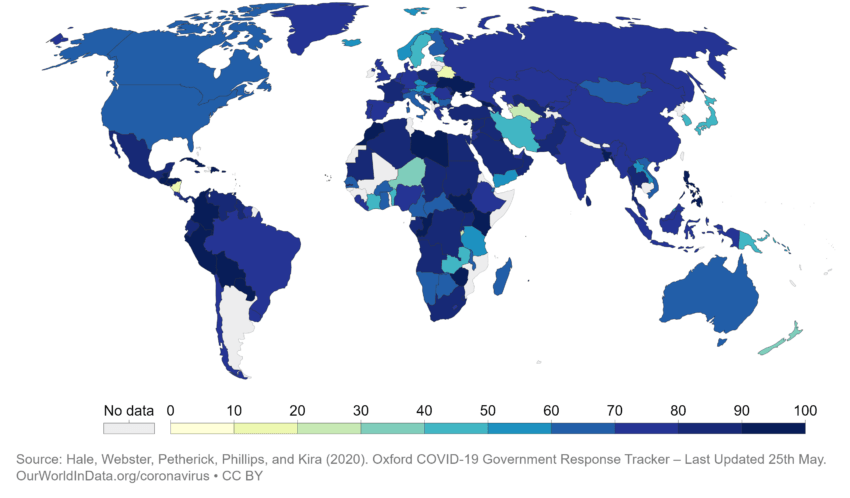
The data for this map is from the Oxford Covid-19 government response tracker (OxCGRT), which collects information on different policy responses from governments around the world and scores the stringency of them. This index only records the strictness of policies, not the effectiveness of them.
At this point in the Covid-19 response, we can look at this chart as a measurement of changing policy; a month ago, New Zealand would have been at the top of the stringency index. Now, it’s among the lowest. With a measurement of 38.49, only Nicaragua, Turkmenistan and Belarus have scores lower than this (several countries, including the more comparable Ireland and Taiwan, do not have data available).
Our neighbour, Australia, is sitting at 66.14. Sweden, infamously relaxed in its lockdown measures, has a score of 47.35.
Hospital beds per 1,000
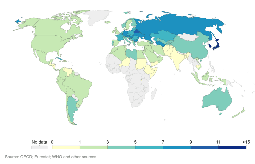
This data is from 2018, so won’t reflect any emergency beds built to accommodate the impacts of Covid-19.
However, we can see that going into this New Zealand was relatively unprepared for a pandemic. We had 2.61 beds per 1,000 people. Our proportion of intensive care beds is even lower; at the beginning of the Covid-19 crisis, we had about 4.7 ICU beds per 100,000 people. Australia has 9.4.
Sweden has only 2.22 beds per 1,000, and the UK has 2.54.
The amount of hospital care available makes a difference to the CFR of a country. New Zealand’s is low, because our case numbers remained within a realm our health system was prepared for. The large case numbers in Sweden and the UK are overwhelming its system; Somerset hospital has just closed its doors to new patients.