
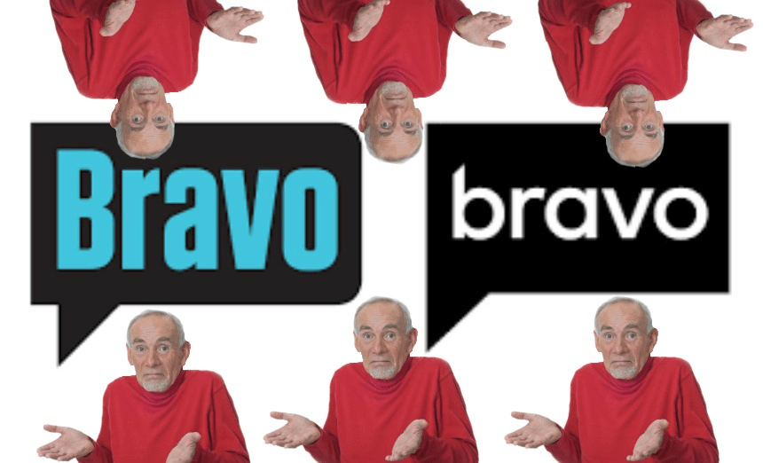

Like a true blue aging reality starlet, the Bravo logo has had a bit of work done in order to attract more men. Alex Casey asks the men of The Spinoff if it has worked.
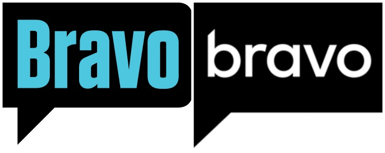
The more observant reality fiends among us may have noticed that Bravo, presumably inspired by the tanned and tucked talent that inhabits the channel, has undergone a dramatic facelift. Next thing you know it will be getting its own plasma smeared across its front and Botox injected into its armpits.
After a little digging into what is far from the first inexplicable, weird-looking TV rebrand this year, I found an article in Variety that claims the move is a “brand refresh”, hoping to expand interest beyond the already dedicated viewers who stack up reality TV hours like a hoarder stacks up containers of their own urine.
“Bravo’s color palette will become more gender-neutral,” the article states, “marking a continued effort to bring male viewers to the network.” To be honest, if The Real Housewives of Sydney and their cape-throwing, 10 minute orgasm-claiming shenanigans isn’t enough, then I’m not sure dropping the capital ‘B’ and adding some sharp corners is going to do it.
But what do I know, for I am just a woman with a predisposed penchant for curvy speech bubbles and bright blue font. I made like Abbey Lee in Dance Moms and sashayed over to ask the men in The Spinoff office to see what they made of Bravo’s macho redesign.
Some of the men, eyes adjusting to the bright lights of the computer screen when disturbed from slumber in The Spinoff’s man cave, were quite taken with the geometry of the speech bubble. “As a gay man,” began Sam Brooks, comedy section co-editor, “I’m quite excited that it looks like a geometric penis.”
Where Brooks awarded the redesign five manly stars, politics editor Toby Manhire was left confused by the new angular shape. “It used to look like a speech bubble but what is it now?” he cried, “Is it a golf flag?” Manhire – perhaps the manliest of the bunch via having ‘man’ in his name – concluded Bravo should have added a handle to make it look like a jug of beer, an aesthetic described as “right up my man street.”
Spinoff staff writer Don Rowe felt that the new logo invoked a primitive masculinity, felt only atop the tallest of tractors and inside the coldest bottles of Speights. He explained it in one scientific equation: “All Blacks-inspired colour scheme + complete disregard for capitalisation = man status confirmed.”
But nobody confirmed the logo’s machismo triumph quite like staff producer José Barbosa. “As a man, hard edges get me hard,” he explained, “so I’m hard out into this rebrand.”